How might we transform the experience for Duke Energy’s Nuclear Planners?
Leading the experience design for a new product in an agile environment through human-centered design thinking methods and iterative design.
PROBLEM
Duke Energy’s Nuclear fleet was looking for ways to bring digital transformation to their planning & scheduling process. They had uncovered some opportunity areas and identified the best one to go after next: a better planning tool for planners. But what did these planners need? And what exactly should that experience look like?
OUTCOME
The final product is called PlannerPro, a planning tool designed for Nuclear planners, with Nuclear planners.
Because of the layout and some game-changing features, the product can save planners about half the time to plan a simple work order that has similar historical work orders, and cuts down time on planning work order tasks in general.
METHODS
Quantitative research, re: surveys
Observational research and user interviews
Co-creation workshops with end-users and tech people
Iterative design through low-fidelity prototyping, high-fidelity prototyping, and continuous user testing of new features
2-week sprint process
MY ROLE
Design Strategist responsible for leading user research, workshops, experience design, and user testing
Served as Senior UX Designer, responsible for the primary UX flow and overall layout
Collaborated with product owner, product analyst, subject matter experts, IT lead, change manager, and development team
Coached team in user research, human-centered design, and onboarded and mentored junior UX designer.
Starting with an idea…
I came on board as a new design strategist at the tail end of a series of design thinking workshops. At this stage, the team had identified an opportunity area and concept to tackle first based on impact and feasibility: a planning tool for planners, with some level of automation.


Validating our assumptions with user research
The team decided to run a survey to get feedback on the concept. To make sure we were also solving for the right problems, I crafted the survey to ask additional questions that would help not only validate the concept, but validate our problem area and give more granularity to it. We had an overwhelming response.

Survey results - 85% engagement from entire planning organization
In addition to the survey, we also conducted follow-up interviews and sites visits, where we sat with a couple planners who walked us through their process, space, and tools.

Planner walking us through their process

Steps for converting a work request and planning a work order: using a low-fid journey to validate my understanding of the process with users in follow-up interviews
Deeper understanding of the current state
This qualitative deep-dive in addition to the quantitative data from the survey brought greater clarity to our problem space. Many of the pain points the planners were feeling were not only rooted in outdated software, but actually stemming from deeper problems with data integrity, process issues, and lack of fleet standardization. Although these were not in scope for our effort, we were able to bring those to light to the corporate functional management team. Our understanding of these process issues were also taken into consideration during development of our tool, as a way to driving planning consistency across the fleet.

Aha moments!
The research challenged some of our assumptions, and helped us better frame our problem area as well as the solution. It also brought to light we had to be careful when we talked about automation.

A more refined concept
Our research gave greater clarity to our problem space and helped us improve and refine our concept even further.


Co-creating the ideal experience with users
With a clearer picture in mind of what we wanted to accomplish, we now needed to get into the weeds of it. So I schedule a full-day co-creative workshop with planners across different sites. We spent the day designing the flow and screens together.


Prototyping and testing… early and often!
As soon as our ideas were floating and I heard us talking in circles, I got to prototyping. It was the fastest way to make sure we were aligned on what we were delivering, and a great way to get feedback on the idea from others.

I was also responsible for the UX Design of the product while we waited on an official assignment. I designed not only the UX but also the UI as well as some interactive animations. With each new critical feature we built, I would prototype and test with end-users, refining the concept and delivering UI specs to the dev team ahead of each sprint.

High fidelity prototype in Axure, with interactive animations

Documentation of feedback during user testing sessions

Higher-fidelity prototyping

High-fidelity UI Design for hand-off

Empathy-building artifacts
To continue with the human-centeredness we established early-on, I created design principles and a persona based on our research as part of the hand-off to the team. Along with a video of the process and pain points in the current system, these were useful tools to help get the new team members up-to-speed and empathizing quickly with our end-users.
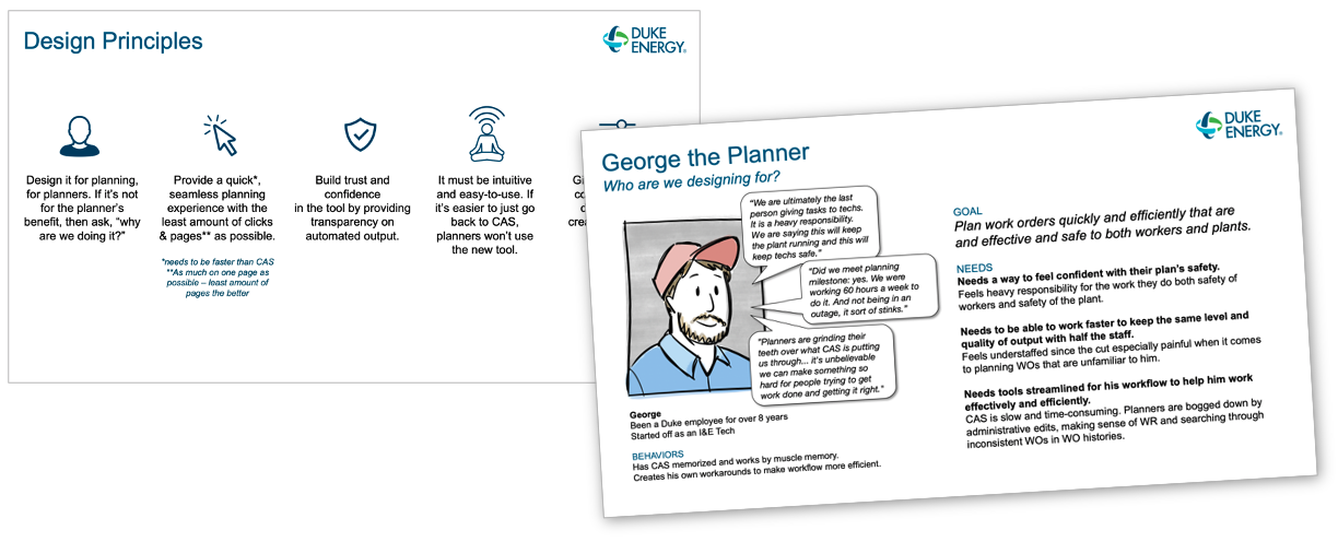
Design Principles and Personas
Designing for change in the organization
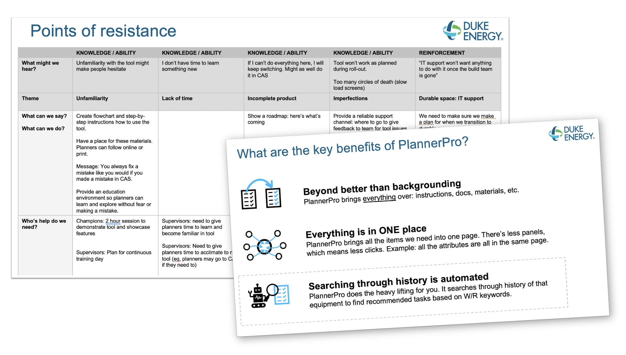
A product isn’t successful unless it’s embraced by its end-users. Designing a human-centered experience for the change the people in the organization would feel was going to be critical to success. We conducted a kick-off workshop with end-users, where we co-created on the key benefits and “what’s in it for me” talking points to inform the communications plan as well as resistance points we may encounter we needed to address.

We used the early market and mainstream market from the adoption curve as user types to get us brainstorming and identifying potential resistance points.

The output of the workshop was a deck with the key talking points in our communications strategy and a plan to address points of resistance and to reduce potential adoption risks going forward.
“I’m taking two weeks off. I wouldn’t be able to do this without Planner Pro.”
Lessons Learned
Listen to and for the outlier conditions.
We designed for large screens, the standard size the planners had on-site (and which most planners had at least two of, if not three at any given time). This was the most commonly used screen size of our user base… but not the only one. And then the pandemic hit, and they were planning at home from their laptops… This impacted the experience slightly, primarily for users that zoomed into their browsers, which made the layout problematic. We didn’t see it coming, but should have followed UX best practices with mobile-first design or a certain minimum level of responsiveness requirements. In addition to that, we didn’t design with accessibility in mind. The screen content was too small and lacked enough contrast for a few of our users, and was a huge miss on my part.
Explore more, quickly.
There were a few design layouts that we jumped on too quickly before exploring alternative options. We missed out on an opportunity to think about a home page that was scalable and innovative, or even a couple flows that would have been more time-saving or fit a mental medal more closely.
Build the most critical parts first… come back to the details later.
This began to happen in the end, and the UX design got pushed to the side more and more… because we didn’t do this earlier on with less critical elements. We spent too much time on details that weren’t as impactful as some critical features.
Measure early and often.
I wish we had given more importance to measuring product satisfaction. If we had done this sooner, we could have had the data to support some key support material and feature development that needed to happen before the product transitioned to support.
Get feedback early and often from the not-usual suspects.
We identified a planner from each site as our pilot group, so that we had a key set of users we could rely on during dev. This was fantastic for a quick check-in or turnaround on feedback, but we kept going too long without getting feedback from a less tech-savvy critic. Not only would this have uncovered some of the outliers I mentioned above, but also may have brought to our attention the lack of support they felt they were receiving with a virtual roll-out (again, the pandemic).


The planner’s tools to get the job done
